

Intro
Gauges are simple charts that indicate progress towards meeting a target. A Radial Gauge is similar in appearance to a speedometer in a car, with a “needle” that moves to indicate the proximity of the current value to the goal. Radial Gauges can include up to six ranges.Power a Radial Gauge
A Radial Gauge requires only two columns or rows of data from your DataSet—one contains categories, and the other contains the values. This creates a “bare-bones” Radial gauge without ranges. You can specify up to six different ranges in a Radial gauge in Chart Properties. For more information, see Understanding Chart Data. The maximum value of a Radial gauge is automatically determined based on the current value. For example, if your current value was 80, the maximum value would be set to 100. If the current value was 155, the maximum value would be set to 200. However, you can set custom minimum and maximum values by specifying ranges. The minimum value of your first range is the minimum value of the gauge, and the maximum value of your last range is the maximum value of the gauge. By default, all of the values in your values column are summed to produce the final value for the chart, even when you select No Aggregation in the value aggregation menu. This is because the General > Value chart property for this chart type is set to Sum by default. This property performs a second aggregation on the chart value in addition to the one selected in the value aggregation menu.Note: Because having two aggregations in a chart is usually undesirable, select No Aggregation in the value aggregation menu, then select your desired aggregation in the General > Value menu in Chart Properties.
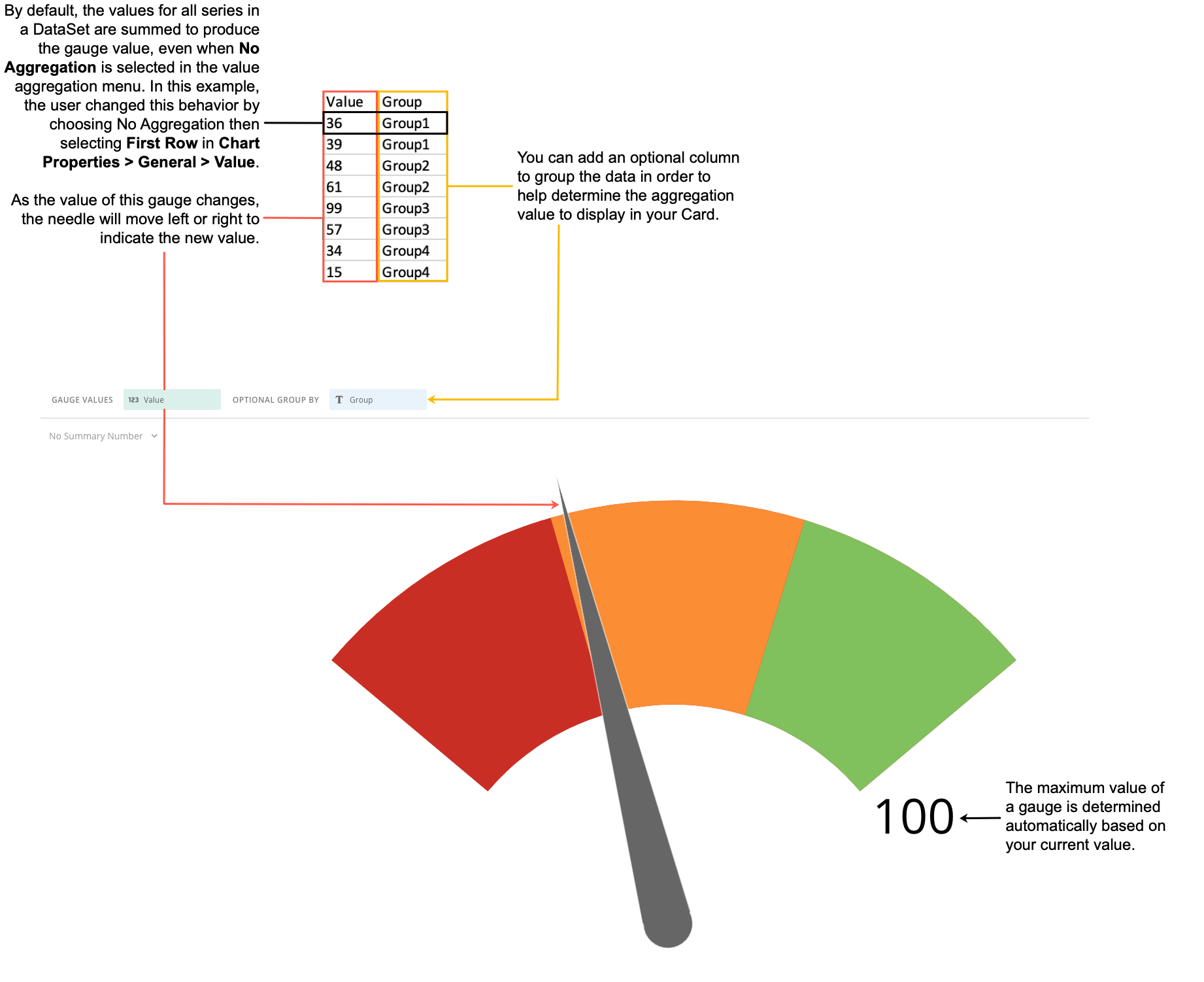
Unique Properties — Radial Gauge
You can customize the appearance of a Radial gauge by editing its chart properties in Analyzer.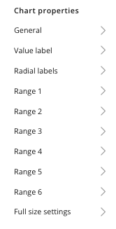
Video - Building a Radial Gauge Chart